


What is Responsive Web Design?
Responsive Web Design makes your web page look good on all devices (desktops, tablets, and phones).
Responsive Web Design is about using HTML and CSS to resize, hide, shrink, enlarge, or move the content to make it look good on any screen:

Setting The Viewport
When making responsive web pages, add the following <meta> element in all your web pages:
Example
<meta name="viewport" content="width=device-width, initial-scale=1.0">
This will set the viewport of your page, which will give the browser instructions on how to control the page's dimensions and scaling.
Here is an example of a web page without the viewport meta tag, and the same web page with the viewport meta tag:
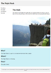
Without the viewport meta tag:

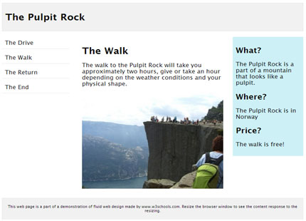
With the viewport meta tag:

0 comments:
Post a Comment